Fused Glass Art
Custom WordPress Website
Mobile Responsive
Custom Images
eCommerce
PoundPig has had some big jobs before but this was without a doubt the most nerve wrecking of them all….not because it was beyond my WordPress skills but because of who the client was… my mum!! She is a glass artist and extremely creative but needed a website revamp because her current site was slightly dated.
I started by creating a PSD so I could visualize the design and really put together the right colours and font. This is a process that can take weeks as you come back to it again and again with fresh eyes and tweak things.
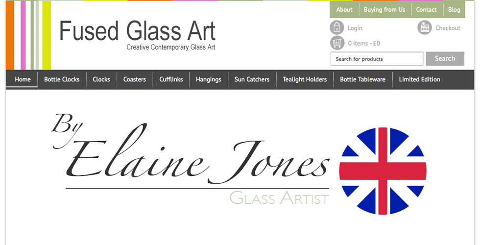
The result is a colourful logo and header with a strong contrast navigation. This is a big change from the previous dark website and has received a lot of positive feedback.
The product categories are nicely listed in the primary navigation making it really easy for the visitor to find exactly what they are looking for. Of course they can also use the search form to the right. I added a little touch to the eCommerce menu making it stand it a bit with the icons.
The overall result is that the site has been rewarded with an increased visibility in the search engines therefore an increase in traffic and a much better internal linking structure so the orders have more than tripled since the new design.
eCommerce
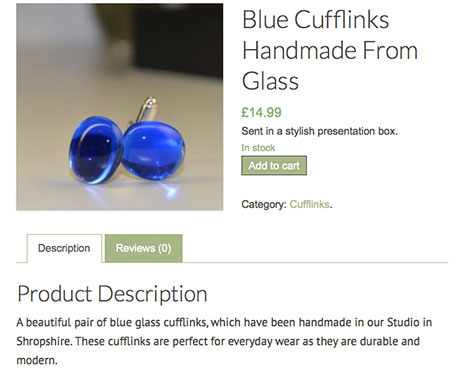
Due to the type of products sold on the site I decided to keep the product page simple but still arty. I did this by using thin font and lines. I also added a hint of blur and shadow behind the product image. The feedback has been positive so it seems the feel of the product page matches the site and the products themselves.

Mobile Responsive eShop

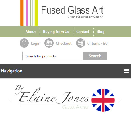
On the mobile version I centred the header navigation as well as the logo. This un-clutters things on the smaller screen. To make it even cleaner I turned the main product navigation into a toggle menu. When tapping it on the mobile device it opens up smooth and fast to show the product categories.
Custom Images
To really make some product categories stand out I decided to use the same idea as with the header; colour and contrast. I incorporated the logo into the same dark grey from the navigation and used that for the background of the product title. To make the products stand out even more I added some shadow to make the images look as they are bulging out. The result is that these products are without doubt, the most viewed on the site.
