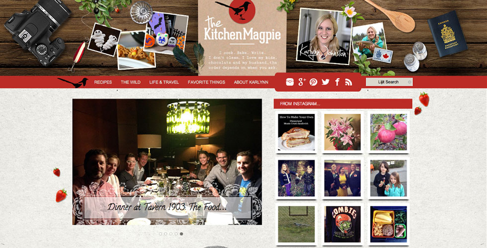
The Kitchen Magpie
Custom WordPress Website
Mobile Responsive
Custom Category Styling
3 Column Drop Down
Mobile Responsive
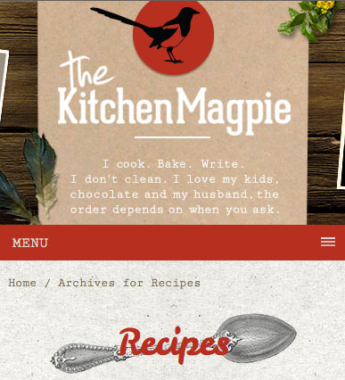
So, needless to say we were happy when the client was adamant about making the new site completely mobile responsive. We designed it so the site scales down when on the iPad where the font stays the same for perfect readability, and on the smaller versions, iPhone and smaller tablets, the sidebar drops below the main content and the navigations turns into a very functional toggle menu with the famous “hamburger” icon.

Custom Category Styling

As previously mentioned, the categories are all styled differently with different background and “overhang” images giving the site a fresh feel but also making the site more interesting for the visitor.
A great way to keep the visitor on the site is by providing relevant links at the end of the post and that is built into this website by creating custom menus that activates depending on what category the visitor is on.
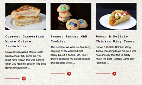
We also created the blog/category pages to list the recipes/post in what is called a Grid Loop with 3 posts next to each other. This looks great and gives the visitor a nice and clean overview of new and related posts. The thumbnails attract the visitor and a nice call to action in the form of image instead of the normal “read more” text.
3 Column Drop Down Menu
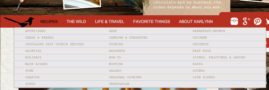
This site has a lot of sub-categories under the main recipes category which resulted in a very long drop down menu where you could not read the last categories unless you were scrolling down. This was solved in the new design by creating a drop down menu in 3 columns. A nice touch that once again provides the visitor with a great user experience.

What The Kitchen Magpie Had To Say
thekitchenmagpie.com